Theming with Microsoft Fluent UI in React
Light mode is good, Dark mode is good. Being able to toggle both in your application is fantastic.
Update: This article has been updated to reflect changes in using Fluent UI v8.

If you have spent any time with React, you have probably run across some UI Frameworks. Recently I discovered what Microsoft has been cooking up with their Fluent UI (formally Fabric UI) framework and it packs quite a punch.
So let us load up a Create React App and see how to toggle themes with React Hooks and the Fluent UI framework.
If needed please feel free to visit the source code 💻
Steps
- Setup project
- Install dependencies
- Configure project
- Fluent UI Theme Designer
- “Hook” everything up
1. Setup project
First we will be using Create React App to quickly bootstrap our application so we can get to coding the important bits. If you are unfamiliar with Create React App they have great Getting Started documentation. So with that, open a new terminal window and run:
> npx create-react-app fluent-ui-themes --template typescriptAfter Create React App finishes the setup process open up your project in your favorite code editor.
Note: You do not have to use TypeScript and we wont be going into any details. But, Fluent UI is built using TypeScript and in my opinion it is a highly beneficial skill to learn for building modern JavaScript applications, especially at large scale.
> cd fluent-ui-themes
> npm start
You should now see the default Create React App start up screen.
Note: If you run into an error starting the application there is a known issue with
react-scripts 4.0.0and you may see an error similar to
TypeError: Cannot assign to read only property ‘jsx' of object ‘#<Object>'create-react-app issue #10110 solution worked to resolve the issue for me
Another issue you may see at this time is
Cannot use JSX unless the '--jsx' flag is provided.This is another Create React App issue, you can try openingtsconfig.jsonand on line #21 paste the following"jsx": "react"or"jsx": “preserve"and the errors may disappear
2. Install dependencies
Shut down your local server
Update: Fluent UI v8 has integrated a previously required package
@fluentui/react-theme-providerIf you are still using Fluent UI v7 you will need to install it otherwise we only need@fluentui/react👍 Fluent UI v8 theme changes.
> npm install @fluentui/react --save3. Configure project
The folder structure we are going to use is fairly popular with React applications.
- Create a folder called
componentsinside/src - Create a folder inside
/componentscalledApp - Create a file called
index.tsinside/App - Update
index.tswith the following code:
./src/components/App/index.ts:
----- copy below this line -----import App from './App';export default App;
- Now move
App.tsxinside of/src/components/App - Update
App.tsxwith the following code:
./src/components/App/App.tsx:
----- copy below this line -----import React from 'react';const App: React.FC = () => {
  return (
    <div>
      Application Component
    </div>
  );
}export default App;
- If your editor does not automatically Update the import statement for the App component path in
./src/index.tsxtoimport App from './components/App'; - Delete the following files:
App.test.tsx, App.css, logo.svg - Create a file
themes.tsinside/srcsetup our theme objects
./src/themes.ts
----- copy below this line -----export const lightTheme = {};export const darkTheme = {};
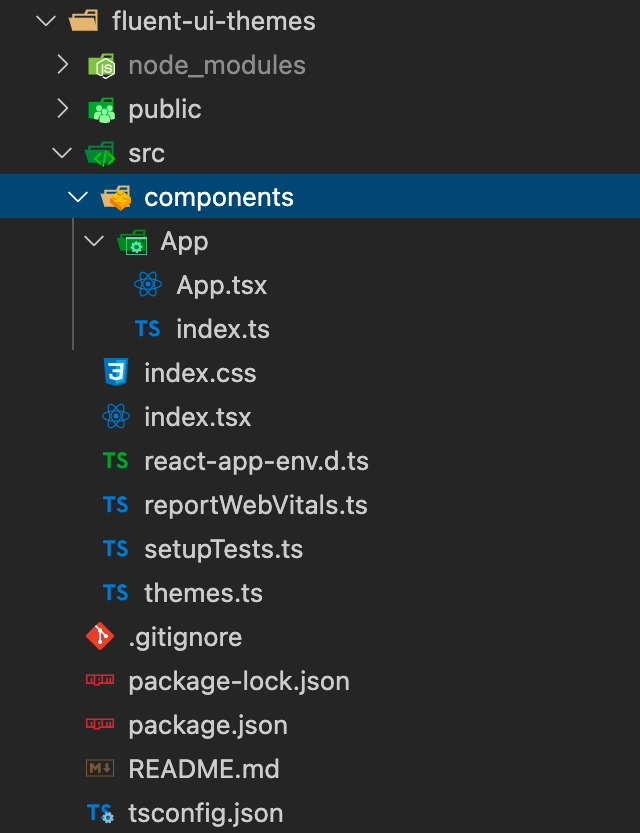
Your project structure should now look like the following:

4. Fluent UI Theme Designer
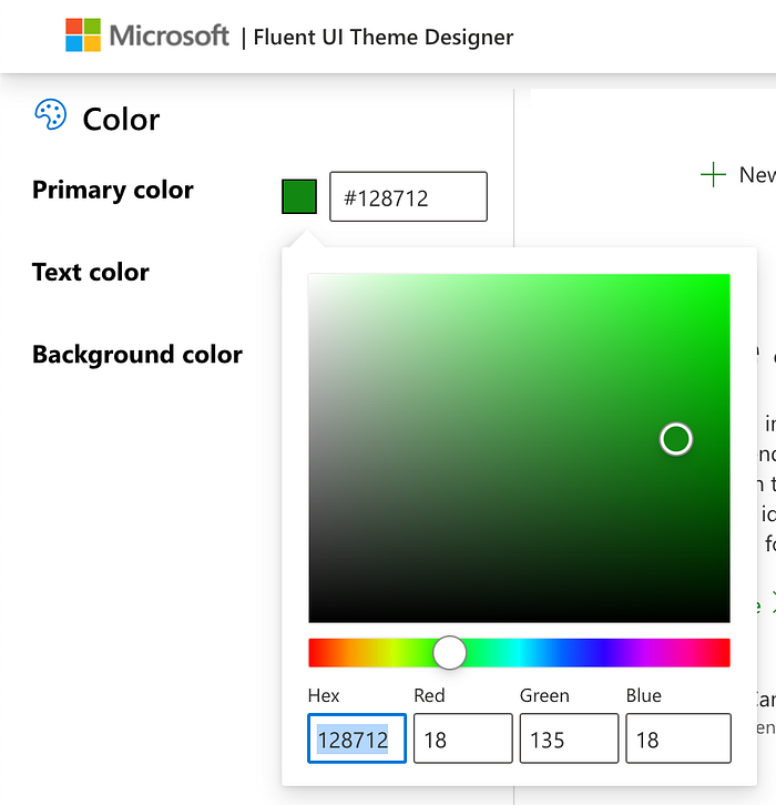
Before we hook things up let us take a minute to get our theme colors by visiting the Fluent UI Theme Designer. This is an excellent tool to configure your applications color palette while adhering to accessibility standards 🔥
Visit Fluent UI Theme Designer
Light Theme:
- Set primary color to
#128712 - Click the “Export theme” button, and in the side panel copy the palette object,
palette: {...}. Paste this object inside thelightThemeobject inthemes.ts
Dark Theme:
- Set Primary color to
#0dbd0d - Set Text color to
#ffffff - Set Background color to
#333333 - Click export button, and in the side panel, copy the palette object and paste this object inside the
darkThemeobject inthemes.ts

Your theme file should look like the following:
./src/themes.ts:export const lightTheme = {
  palette: {
    themePrimary: '#128712',
    themeLighterAlt: '#f1faf1',
    ...rest of key value pairs...
  }
};export const darkTheme = {
  palette: {
    themePrimary: '#0dbd0d',
    themeLighterAlt: '#010801',
    ...rest of key value pairs...
  }
};
With our theme objects set, it is time to hook everything up 😃
5. “Hook” everything up 🎣
Start your server
> npm startFor this next step we are going to use React hooks with the Fluent UI Theme Provider and a couple of Fluent UI components.
Wrap our application component with the Theme Provider and import our themes
./src/components/App/App.tsx:
----- copy below this line -----import React from 'react';import { ThemeProvider } from '@fluentui/react';import { darkTheme, lightTheme } from '../../themes';const App: React.FC = () => {
  return (
    <ThemeProvider applyTo="body" theme={lightTheme}>
      Application Component
    </ThemeProvider>
  )
}export default App;
Now if you update the Theme Provider theme prop to darkTheme save and allow the browser to refresh, you will notice that our background will become dark gray with white text.
This is great but we need to be able to toggle between the themes, so let us add a simple useState hook, logic for our theme prop, and a Fluent UI Toggle component that replaces the “Application component” text.
./src/components/App/App.tsx:
----- copy below this line -----import React, { useState } from 'react';import { ThemeProvider, Toggle } from '@fluentui/react';import { darkTheme, lightTheme } from '../../themes';const App: React.FC = () => {
  const [useDarkMode, setUseDarkMode] = useState(false);return (
    <ThemeProvider
      applyTo="body"
      theme={useDarkMode ? darkTheme : lightTheme}
    >
      <Toggle
        label="Change themes"
        onText="Dark Mode"
        offText="Light Mode"
        onChange={() => setUseDarkMode(!useDarkMode)}
      />
    </ThemeProvider>
  )
}export default App;
Awesome, we are now toggling our theme!
Ok, so we are almost done! For this last part we can import a couple more Fluent UI components and get an introduction to the grid system with Stack and see or primary theme colors change with the PrimaryButton
./src/components/App/App.tsx:
----- copy below this line -----import React, { useState } from 'react';import { PrimaryButton, Stack, ThemeProvider, Toggle } from '@fluentui/react';import { darkTheme, lightTheme } from '../../themes';const App: React.FC = () => {
  const [useDarkMode, setUseDarkMode] = useState(false);  return (
    <ThemeProvider
      applyTo="body"
      theme={useDarkMode ? darkTheme : lightTheme}
    >
      <Stack>
        <Stack.Item>
          <PrimaryButton
            text="Alert"
            onClick={() => alert('I am an alert')}
          />
        </Stack.Item>
        <Stack.Item>
          <Toggle
            label="Change themes"
            onText="Dark Mode" offText="Light Mode"
            onChange={() => setUseDarkMode(!useDarkMode)}
          />
        </Stack.Item>
      </Stack>
    </ThemeProvider>
  )
}export default App;

Congratulations, you should now have a successful theme toggle for your application using Fluent UI and React Hooks 🚀
So to recap we
- Used the Toggle, Stack, and Primary button components from Fluent UI
- Learned about the Fluent UI Theme Designer
- Integrated the future theme solution for Fluent UI with the Fluent UI Theme Provider
Hope you enjoyed this tutorial and if you have any suggestions or issues please feel free to leave me a comment and I will do my best to get back with you.
